

Building K2U’s technology learning hub
How design leadership turned a single Salesforce training store into a multi-technology education brand and media hub, first launched as Focus on Tech and now the website of K2U, in eight months from brief to launch-ready.
The challenge
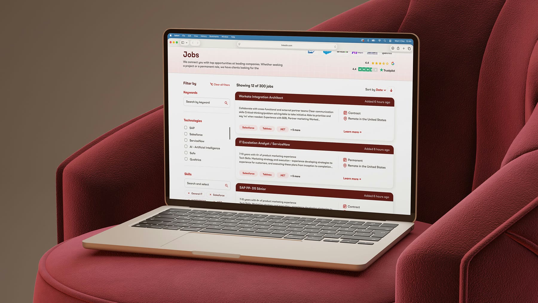
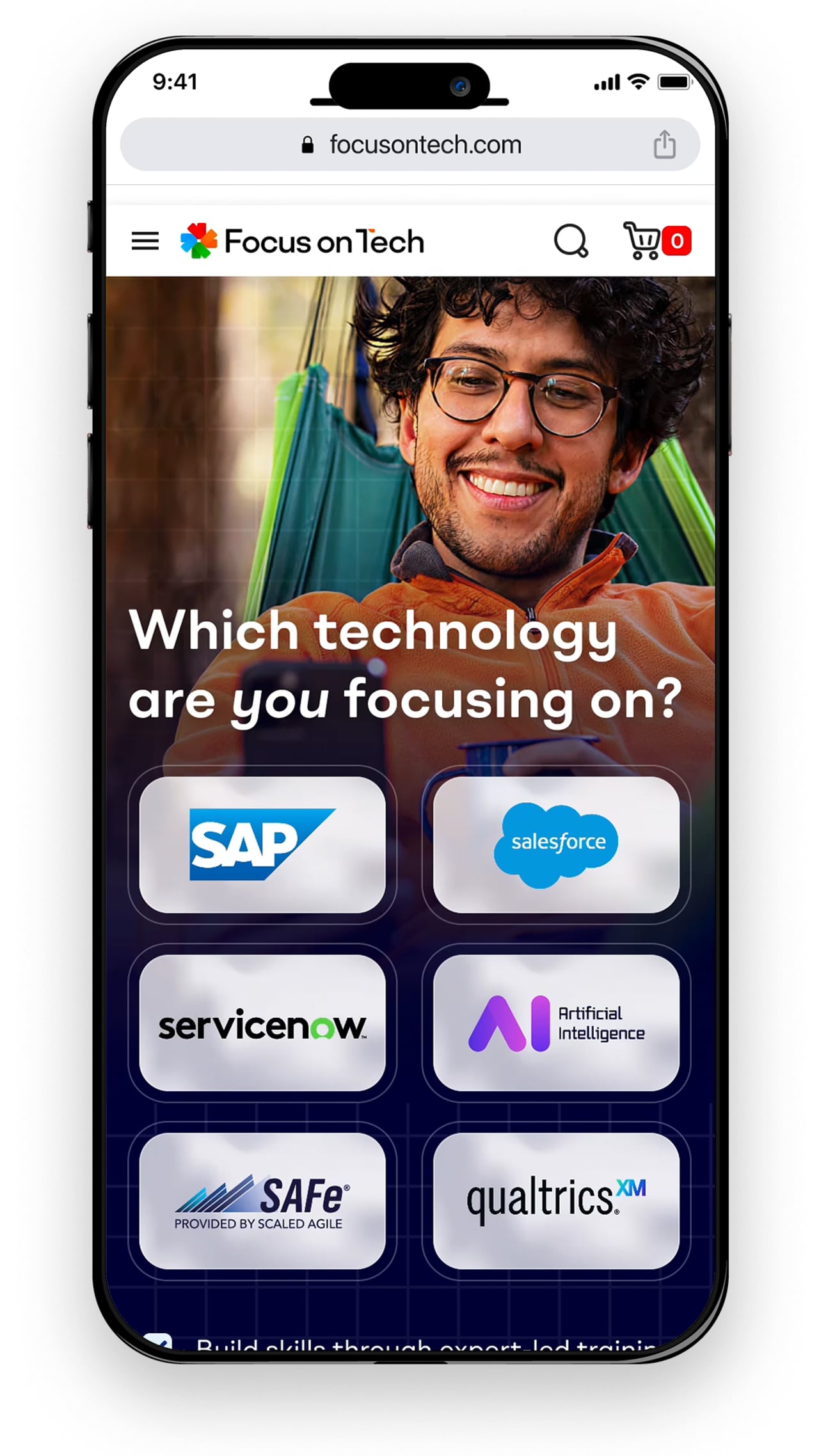
Recently acquired Salesforce training provider Focus on Force was adding five more technologies and methodologies, including artificial intelligence. Courses, forums, a job board and training materials all needed to live on one platform, without losing the old store’s hard-won SEO and customer loyalty.
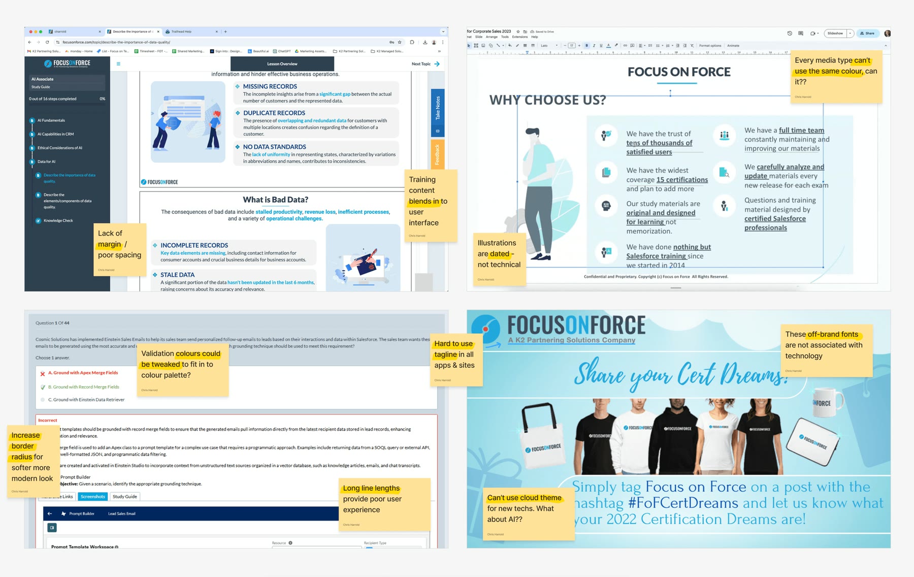
The existing brand looked messy and dated, with terminology and navigation changing from page to page. The board wanted to keep its heritage, so the platform launched under a name in the same pattern, Focus on Tech. It has since become the website of K2U, home to the group’s training brands. Independent testers summed up the old site:
It’s kind of giving college project vibes, not professional. Drop down menus are way too busy. Dated design. Course descriptions are not well organised.”
What we did
We led every part of the design across a four-part project: a new brand, working prototypes of the platform, guidance through development, and handover and training for the teams. Our small design team, a UX researcher, two UI/UX designers and two designers, worked with marketing, project managers, a scrum master and developers across several continents.
Setting the foundations
We brought together creatives, project managers and developers from the parent company’s acquired businesses, in-house teams and new hires, with an agency advising on the complex migration. Stakeholders had pictured a large hub or portal; we refined it into a more commercial, less resource-hungry approach.

Auditing the brand, competitors and audiences
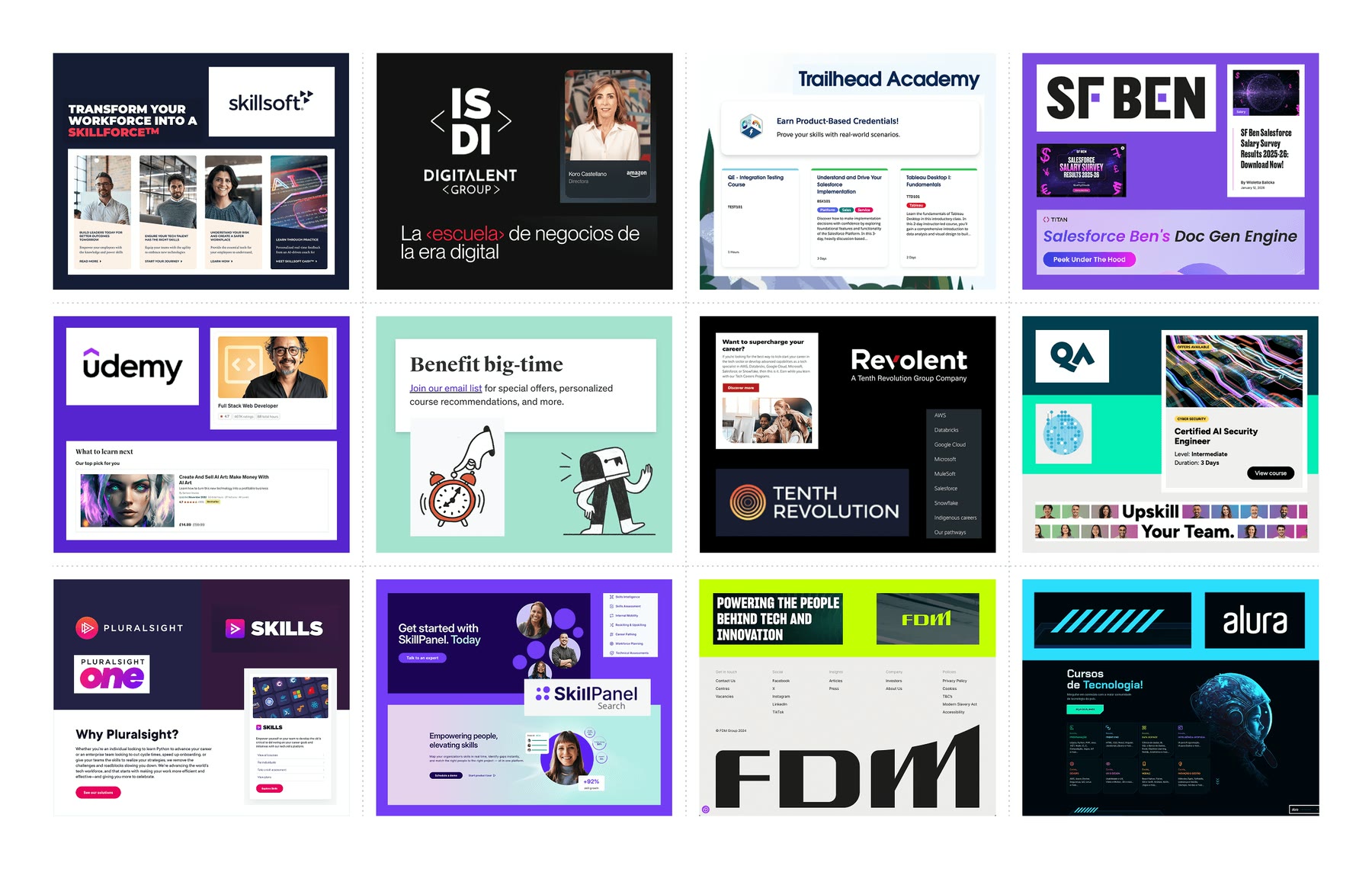
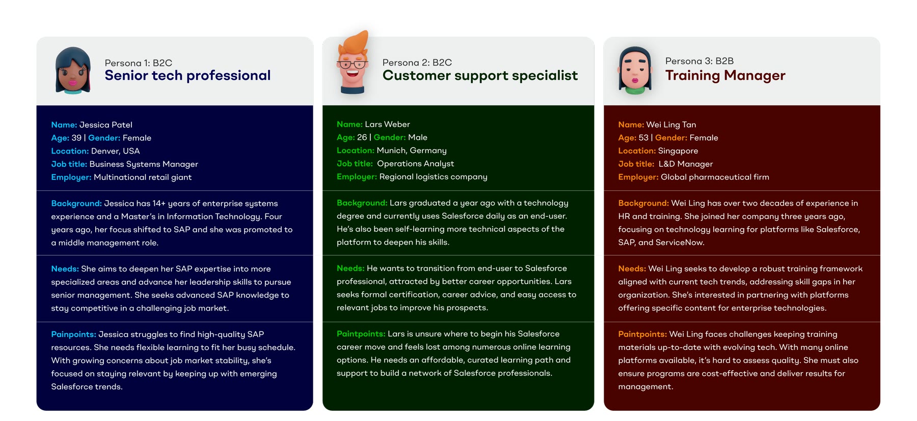
We audited every customer touchpoint, from marketing to checkout, and commissioned testing from Conversion Rate Experts to confirm what we found. Competitor research covered training providers like Udemy and Coursera, job boards like Indeed and media platforms like Salesforce Ben. Detailed personas kept every decision focused on students, experienced professionals and businesses.
A logo about focus
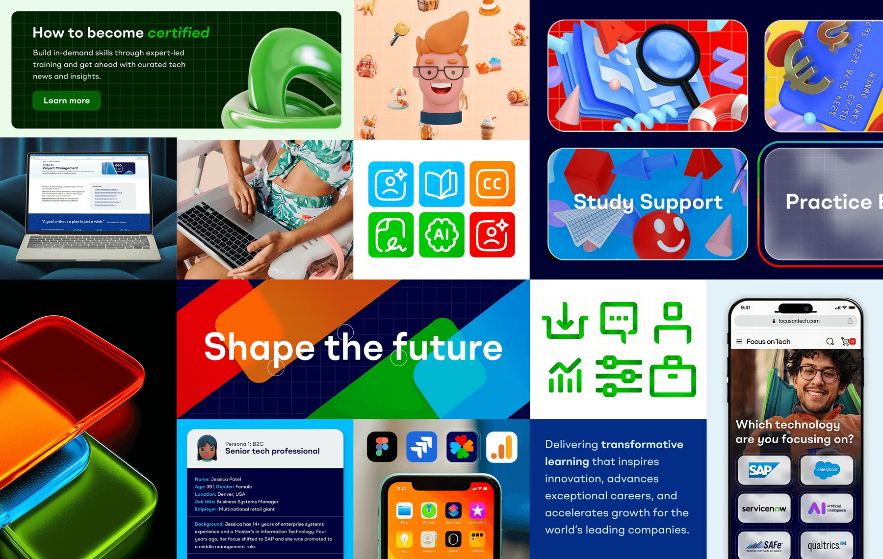
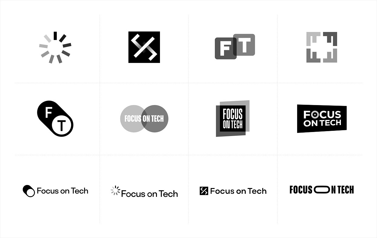
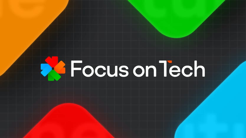
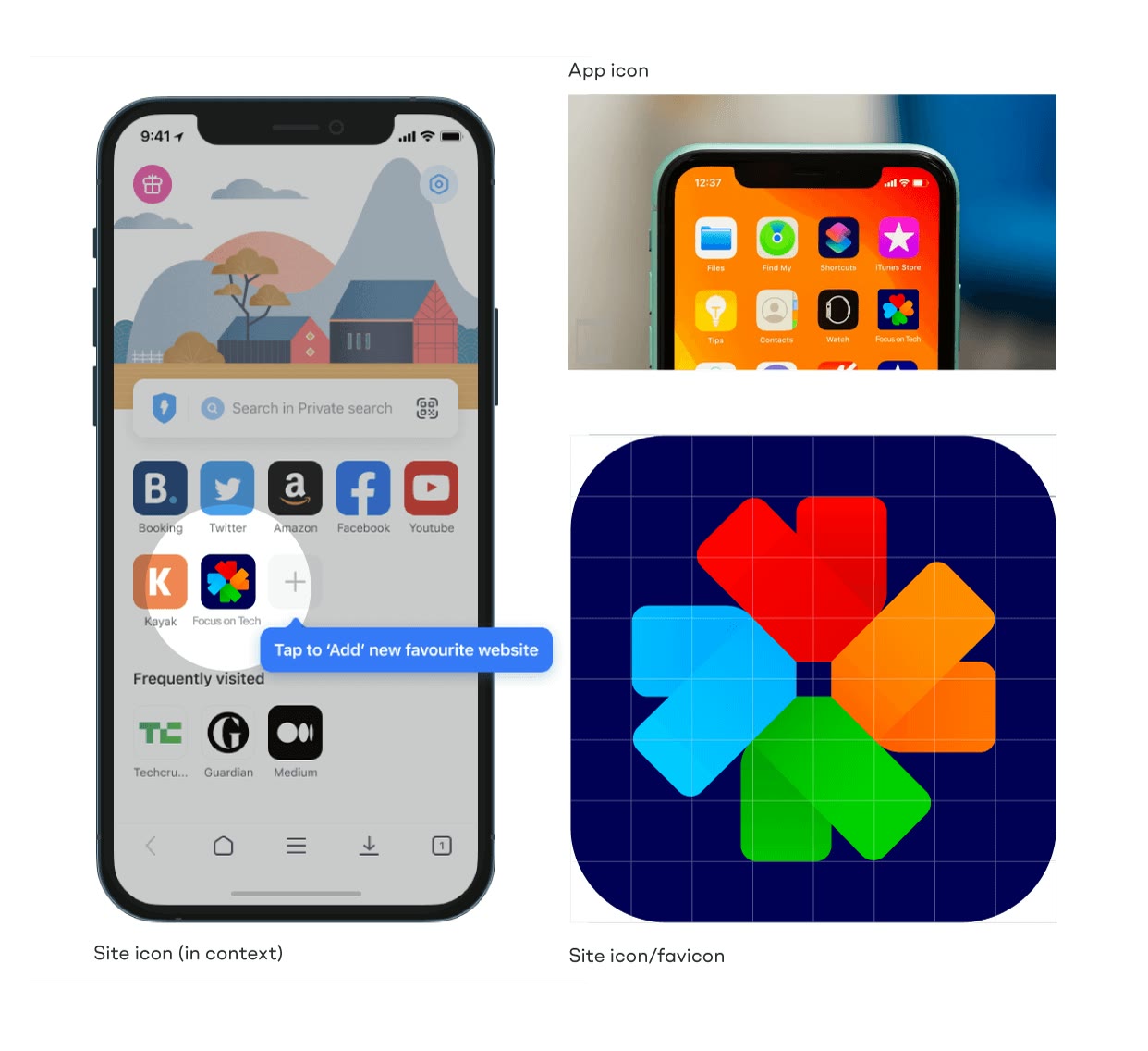
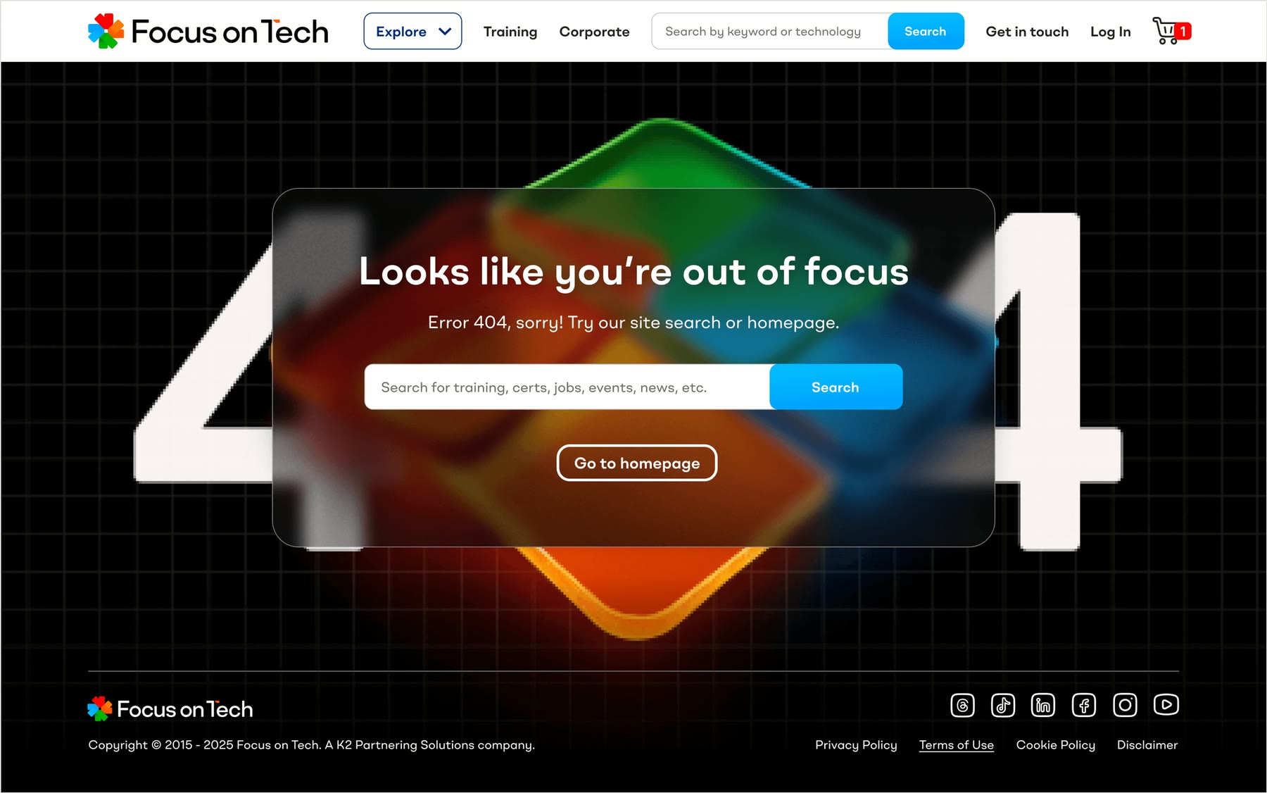
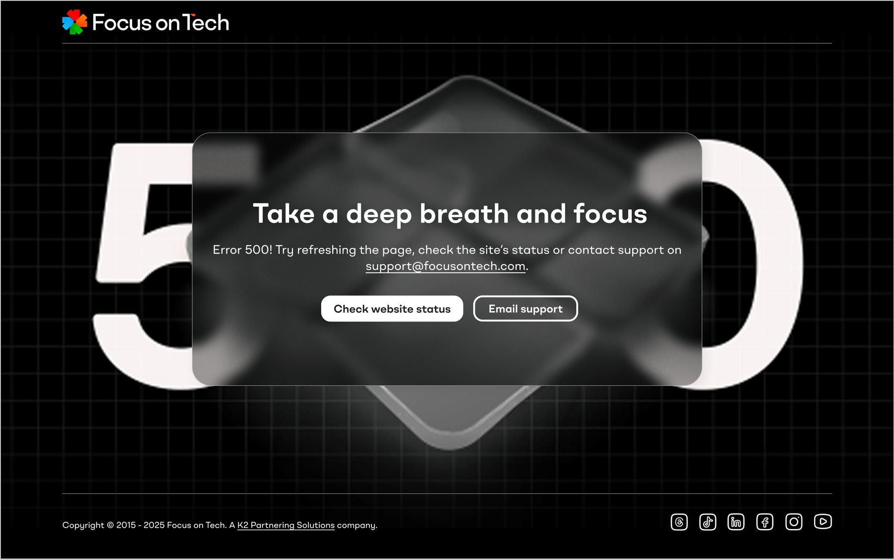
The logo needed to show focus and transparency, and nod to the parent company. We built the brandmark around a crosshair that also reads as crop marks or a camera shutter, rendered in liquid glass, with red, orange and blue taken from the three brands in the family.
A colour-coded design system
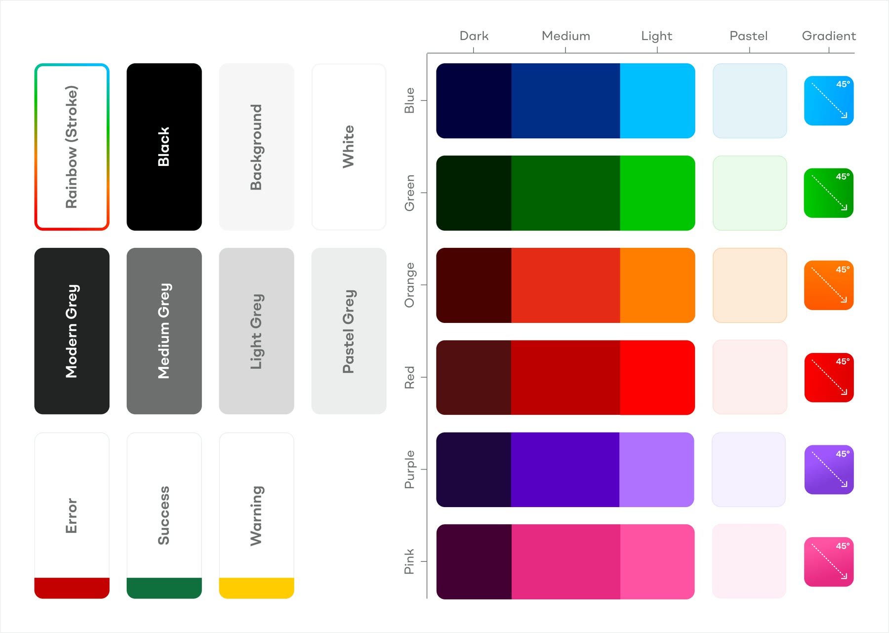
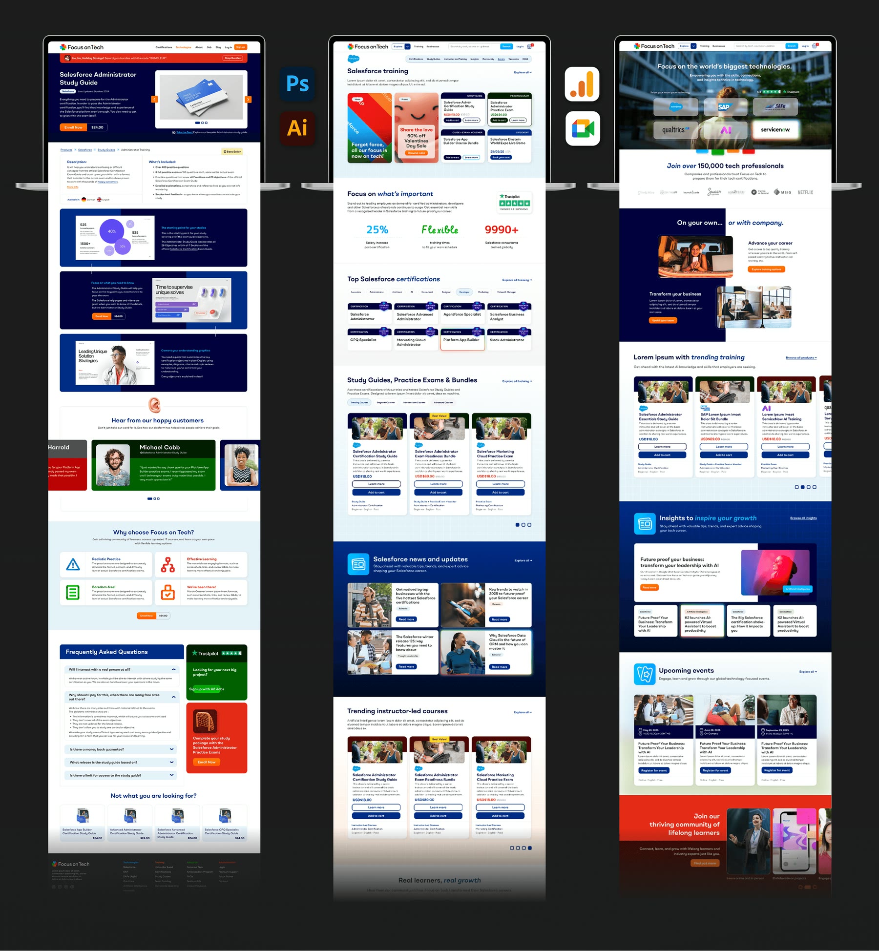
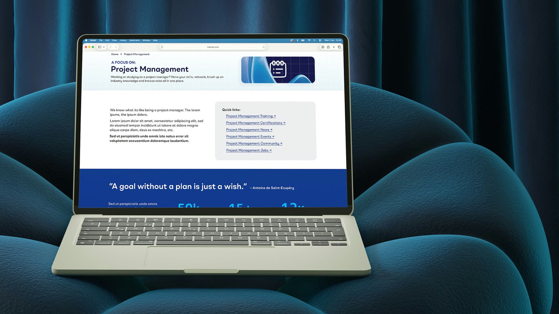
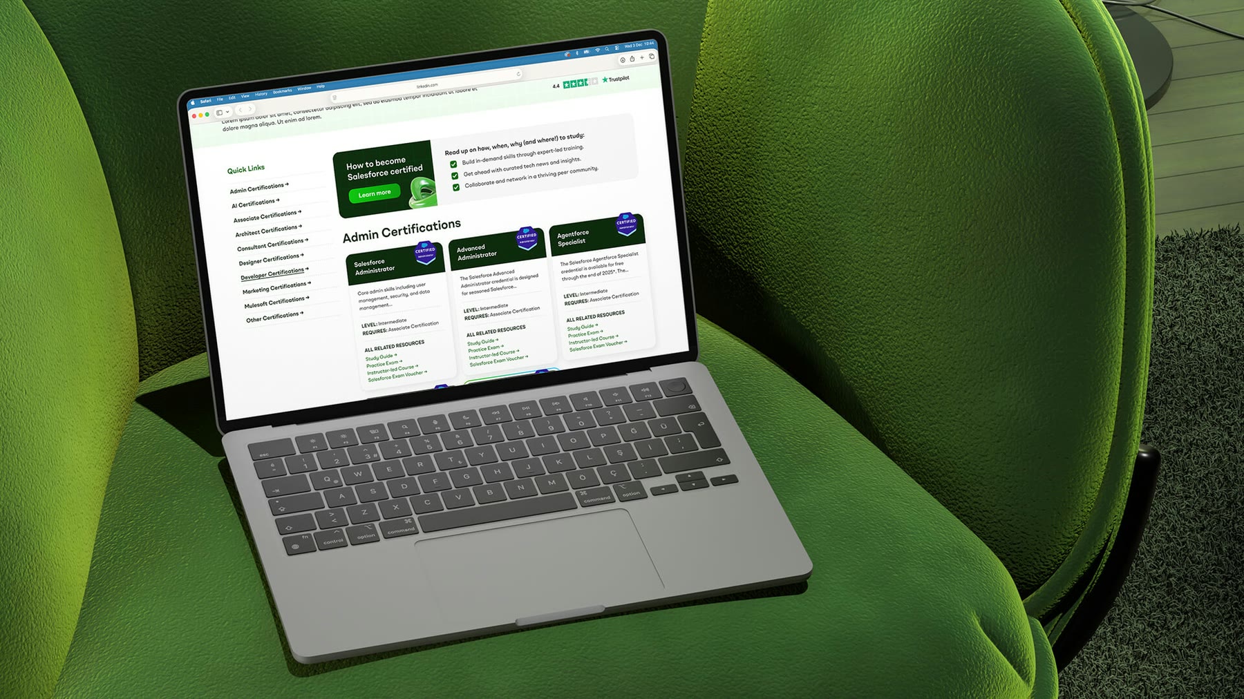
The site would hold six content types. We designed six palettes, each with dark, medium, light and pastel shades, the darker ones meeting WCAG AA, plus a range of greys, so visitors always know where they are and what’s in their basket.
Icons, illustration and photography
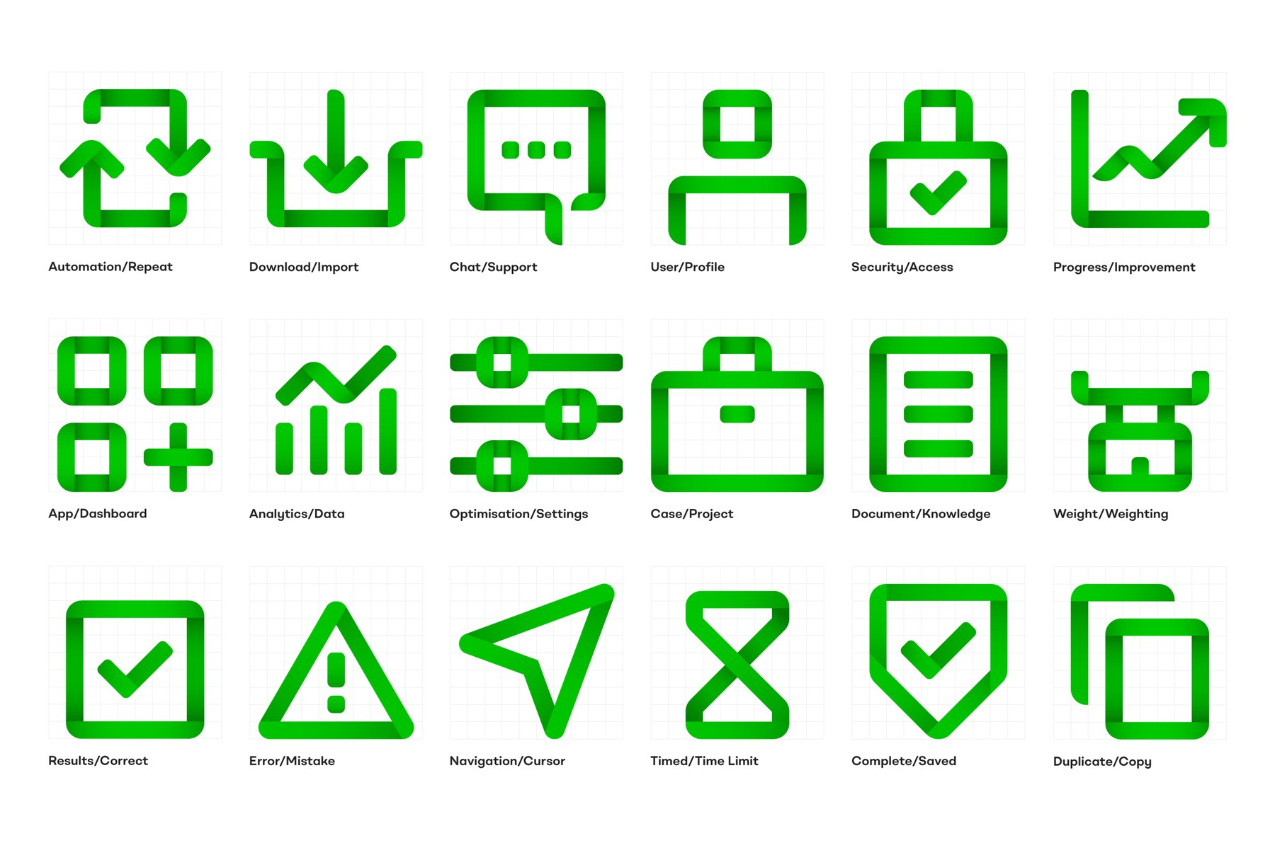
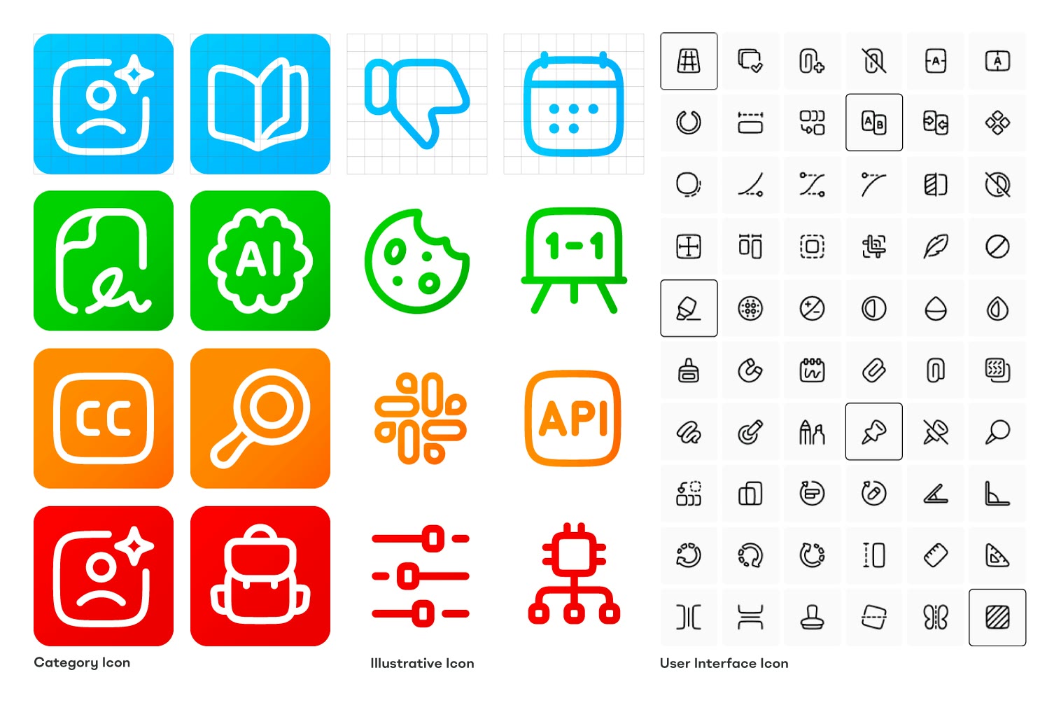
Our bespoke ribbon-style icons proved too ambiguous in testing, so we kept them for ads and social media and customised Streamline’s Plump Line set for the interface.
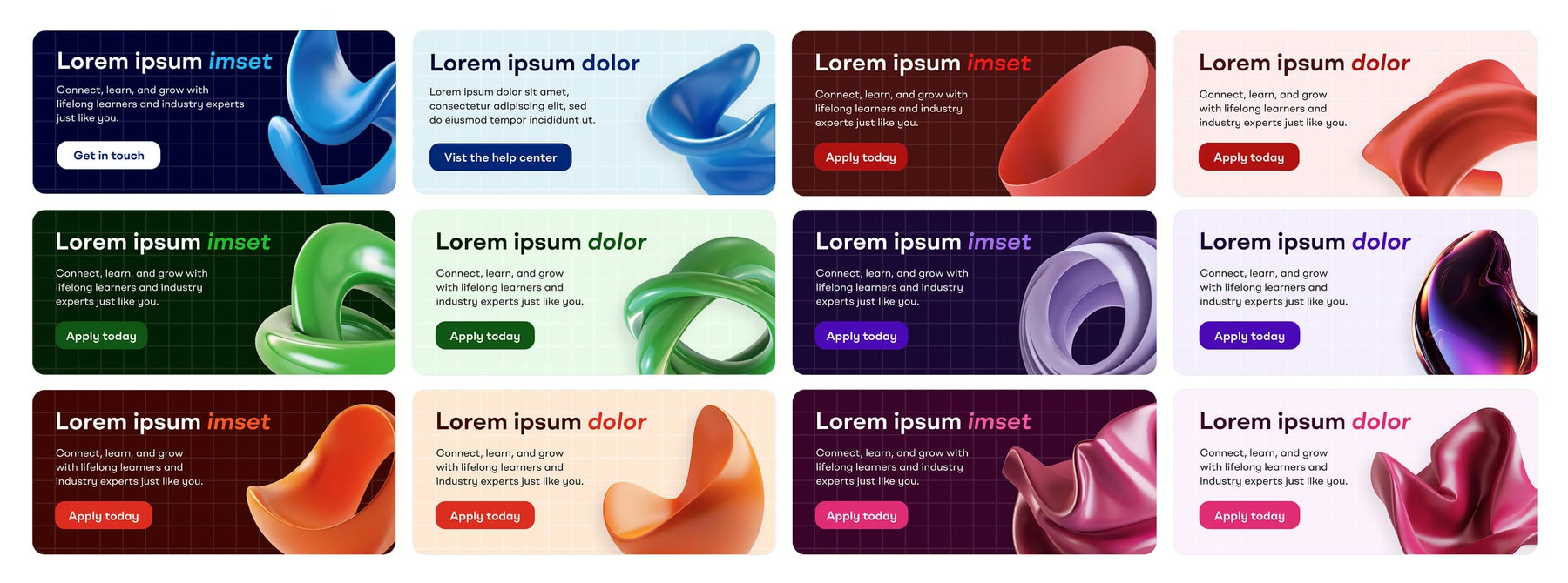
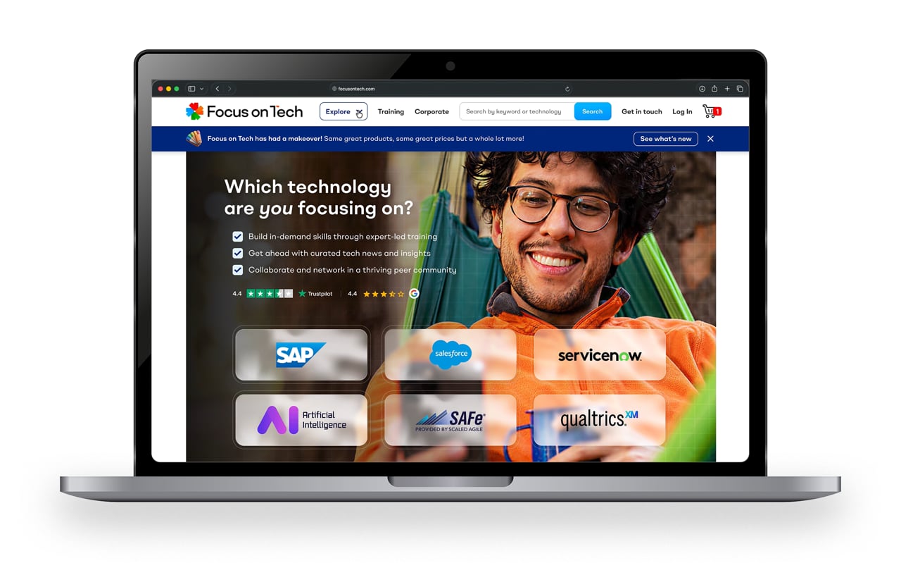
For illustration we created ‘fluid shapes’: abstract 3D forms suggesting an elastic, learning brain and the cloud, colour-coded to each section. The photography art direction shows tech professionals as real people, in vibrant settings that echo the palette.


Wireframes, prototypes and presenting
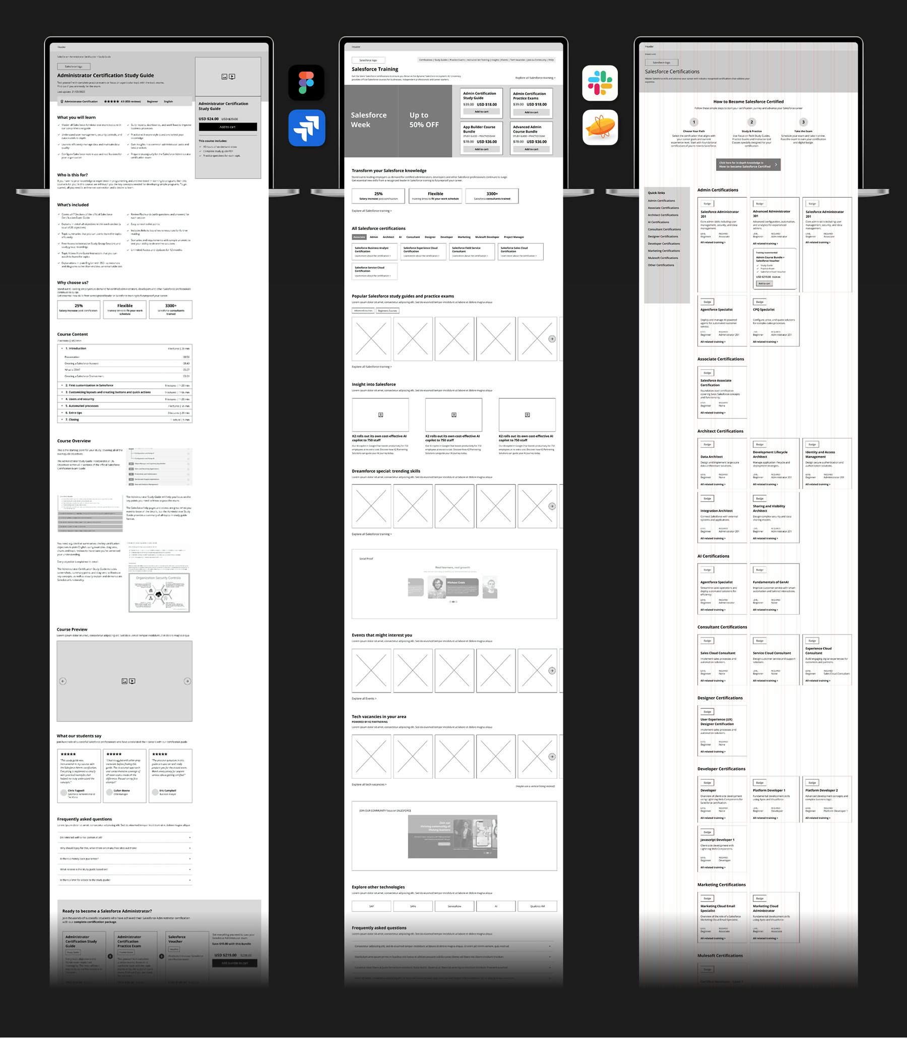
Analytics showed most people browsed and bought on laptops, so we designed for that width first. Wireframes and proof-of-concept pages for the homepage and two core templates secured buy-in, and stakeholder feedback reshaped the site into an intuitive, menu-like ‘discovery hub’ rather than a hard sell. Our senior UI/UX designer in Brazil then built a full Figma prototype and component library under our direction.
Development, quality assurance and handover
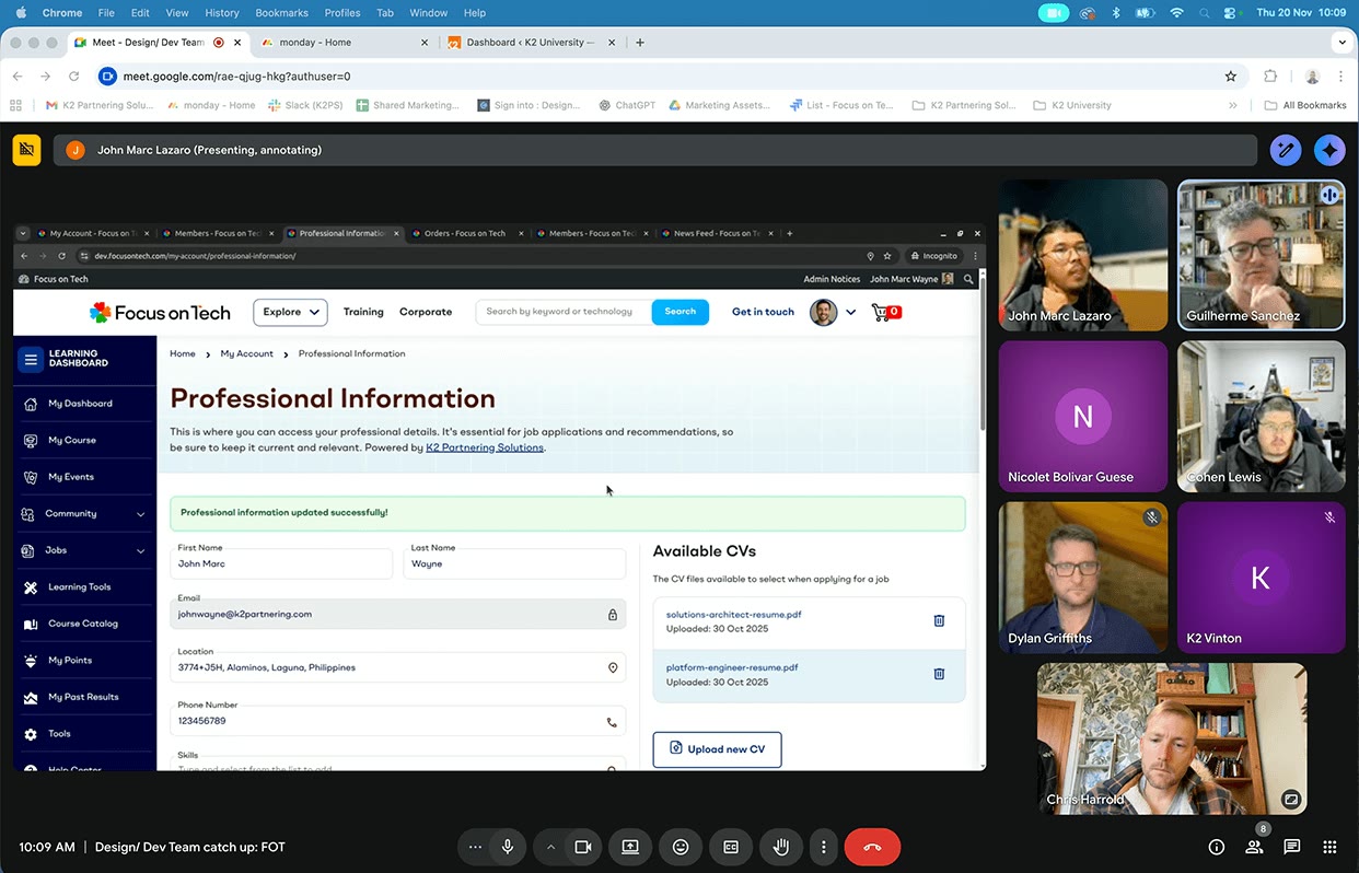
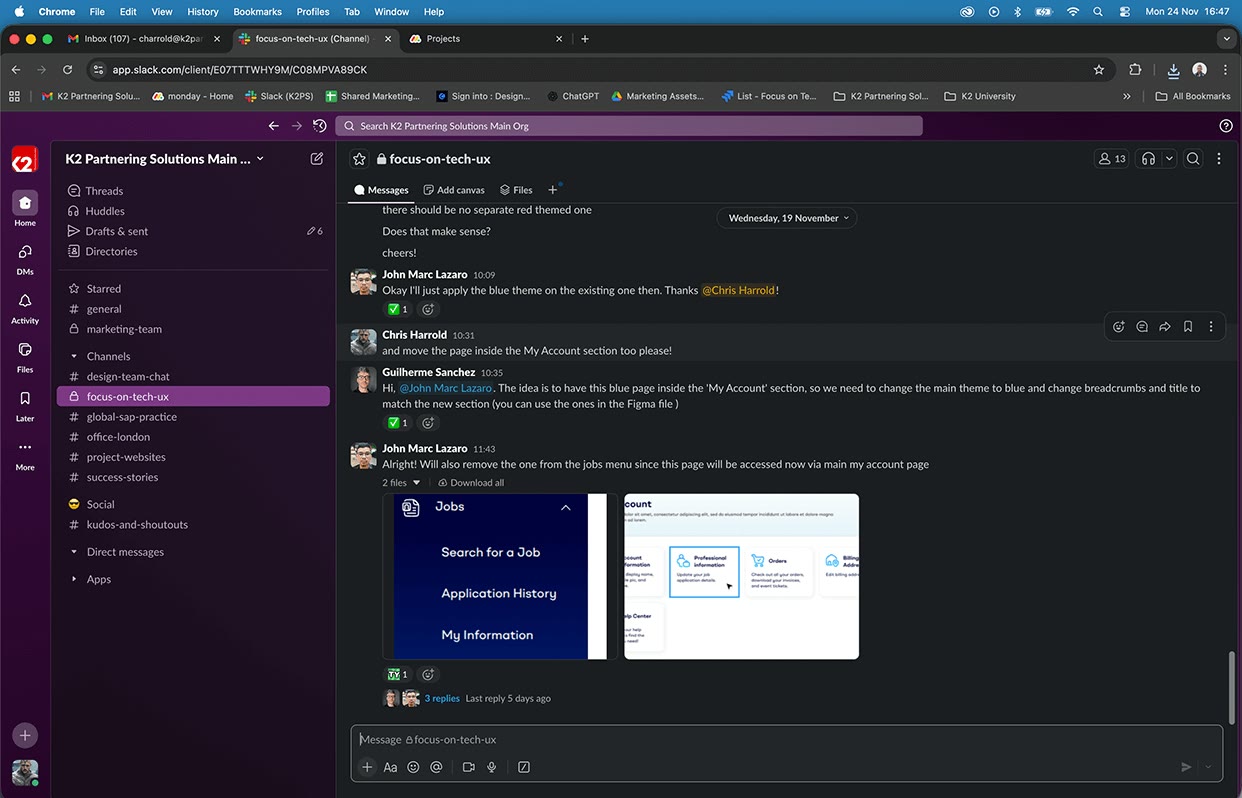
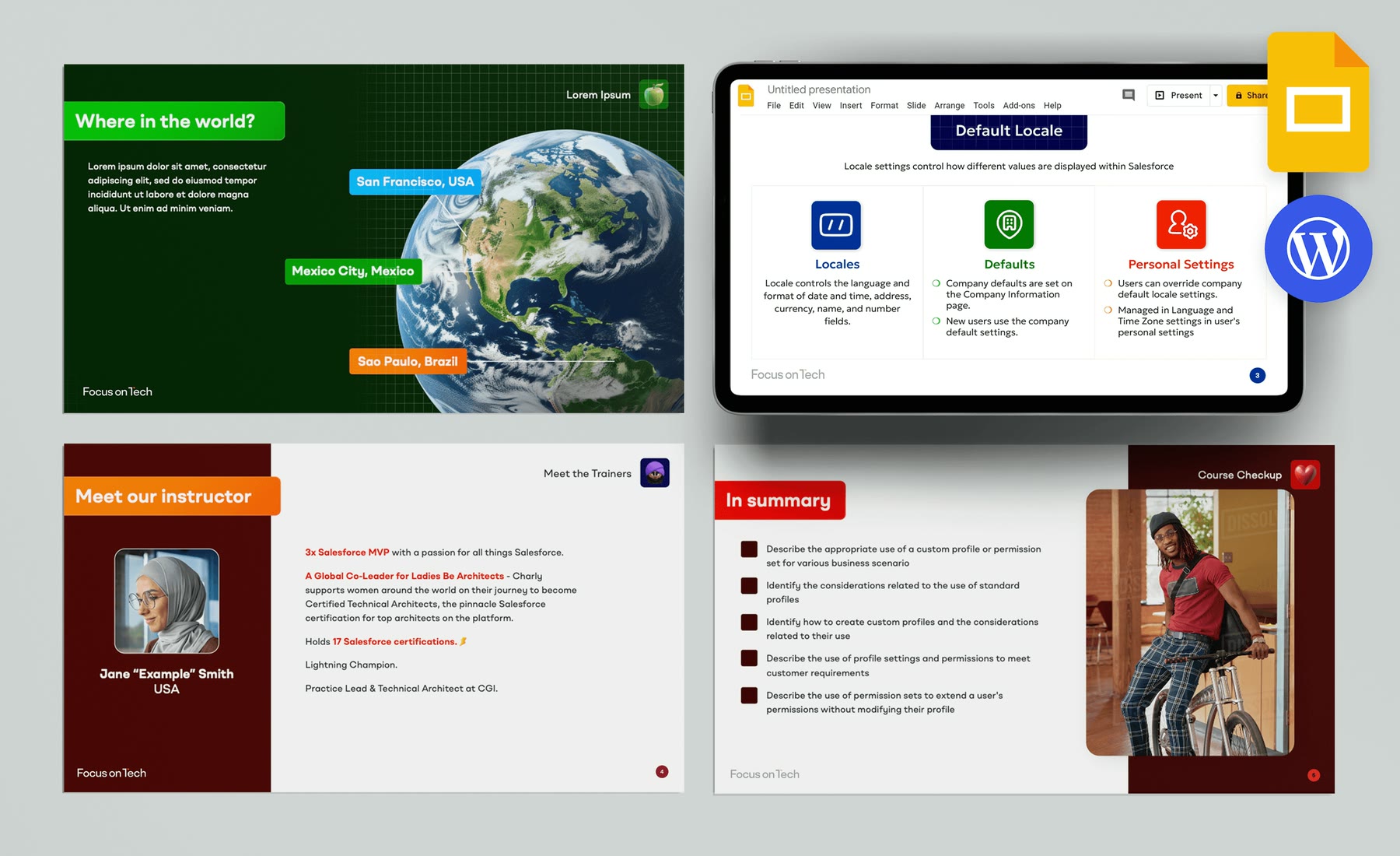
We met the developers every week to review progress, supply assets and keep the build true to the design, then worked through the QA team’s findings, deciding what to fix before and after launch. Finally, we trained the education, marketing, sales and web teams who would run the platform, and piloted AI tools including Beautiful.ai, Canva, Midjourney and ChatGPT to speed up the rollout.
I’ve learnt a lot working next to you. On design, UX, UI, etc. It made me grow a lot. You did an amazing job”
8months
from brief to launch-ready and handover
5+
complex integrations, including CRM, LMS, payments, job board and forum
15+
successfull collaboration of specialists and SMEs from around the world
Enabled
stakeholders and marketers, with a design system and template library
The result
The platform was built and handed over ready to launch. In place of launch metrics:
- Stakeholders were delighted: K2U now has a brand and platform that can scale with its ambitions
- SEO/GEO equity preserved from the original ecommerce store
- The new brand tells a multi-technology story while keeping the original store’s SEO, the core challenge that started the project
- Colour-coding lets visitors find their way around a complex hub intuitively
- A design system, component library and guidelines let internal teams create pages quickly and consistently
- A single-product store became a learning platform ready to grow across technologies and markets
Testimonies
I just wanted to tell you you’ve been awesome every time we’ve worked together.”
Wanted to say it was really great working with you. You were always easy to collaborate with and brought such good energy. You’ve been doing great work.”
Going through a similar transformation and in need of a new brand strategy? Tell us a little about it and we’ll get back to you.